A cartogram, or a value-by-area map, is a representation of a map where geographic regions are modified to reflect a statistic such as population or income. Geographic regions, such as countries, states and provinces of a map, are scaled by area to visualize some statistical information, while attempting to keep the overall result readable and recognizable.
Cartograms have a fairly long history. In this page, we attempt to put together a list of early cartograms, as well as some recent visualizations of cartograms.
Early cartograms
1837
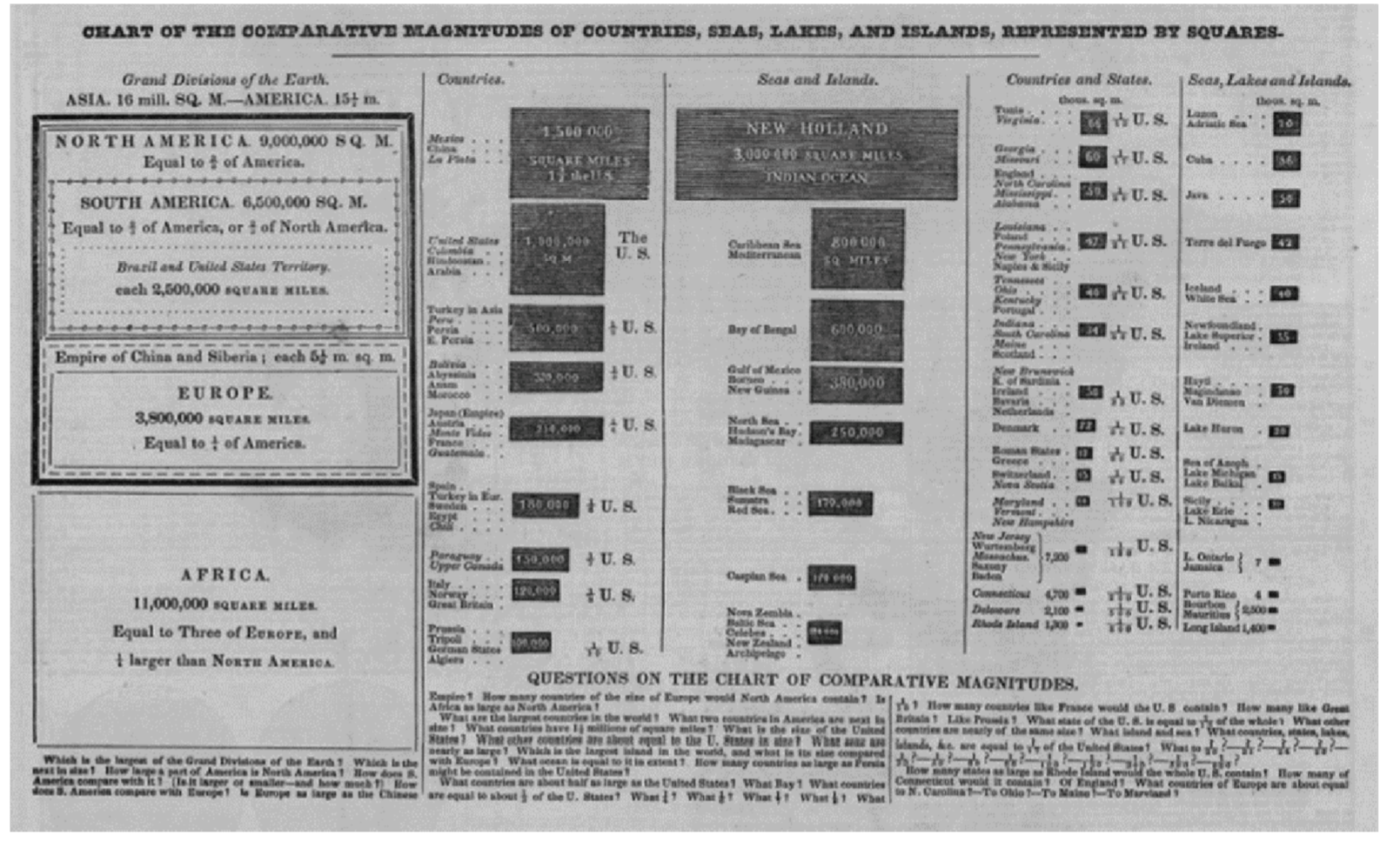
Cartogram-like representations can be found in 19th century atlases in the US. One of the earliest examples is published by William C. Woodbridge in 1837 in his "Modern atlas, on a new plan, to accompany the system of Universal Geography" where he used "comparative charts" of sizes of North America, Europe, Africa, and South America. This comparative chart of Woodridge was improved and reproduced in 1843 "Modern Atlas" and in the "School Atlas, to accompany Modern School Geography" of 1845.
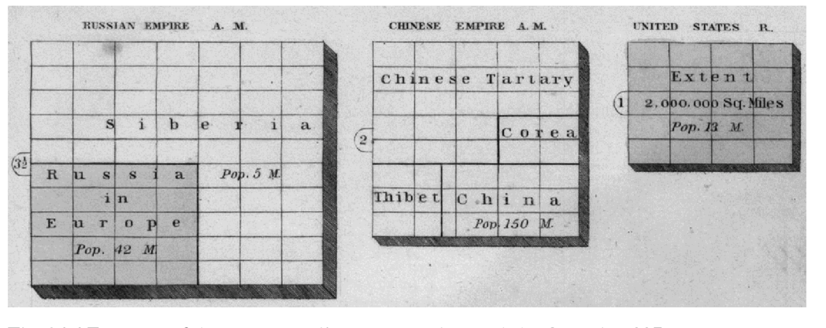
In 1837 Jesse Olney also presented a coloured cartogram-like representation in his "New and Improved School Atlas" to exhibit the comparative size, population, form of government and number of square miles in each of the principal empires and kingdoms.
1897
The Rand McNally World Atlas of 1897 also published some cartogram-like representations. One such representation had two circles for each empire, one symbolizing the area of the empire, other symbolizing the population.
1910
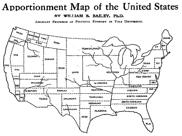
Professor William B. Bailey (Yale University) created the "Apportionment Map of the United States" scaling the size of the states to their population and this was published in "The Independent" newspaper on 6 April, 1911.
More cartogram-like representations
French economist, geographer and educator Pierre Emile Levasseur is the pioneer of the use of cartogram-like representations in school textbooks. The above figure shows an example taken from page 778 of his geographic textbook, "La France, avec ses Colonies..." published in Paris in 1875.
According to some authors [3], "Hermann Haack and H. Wiechel published a cartogram depicting election results from the German Reichstag in 1903". However, in early 20th century, the term "cartogram" was confusingly used to mean various kinds of graphs and statistical maps, for example, bar graphs, graduated circle maps, and even choropleth maps. Funkhouser used the term "cartogram" repeatedly in his 1937 paper, to mean what we now call choropleth maps. Funkhouser also printed the cartogram-like representation in his paper that Professor Emile Levasseur used in his textbooks.
Cartograms in School Cartography
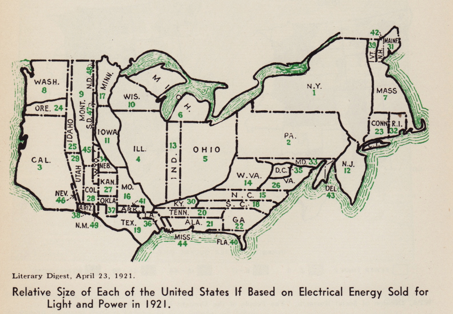
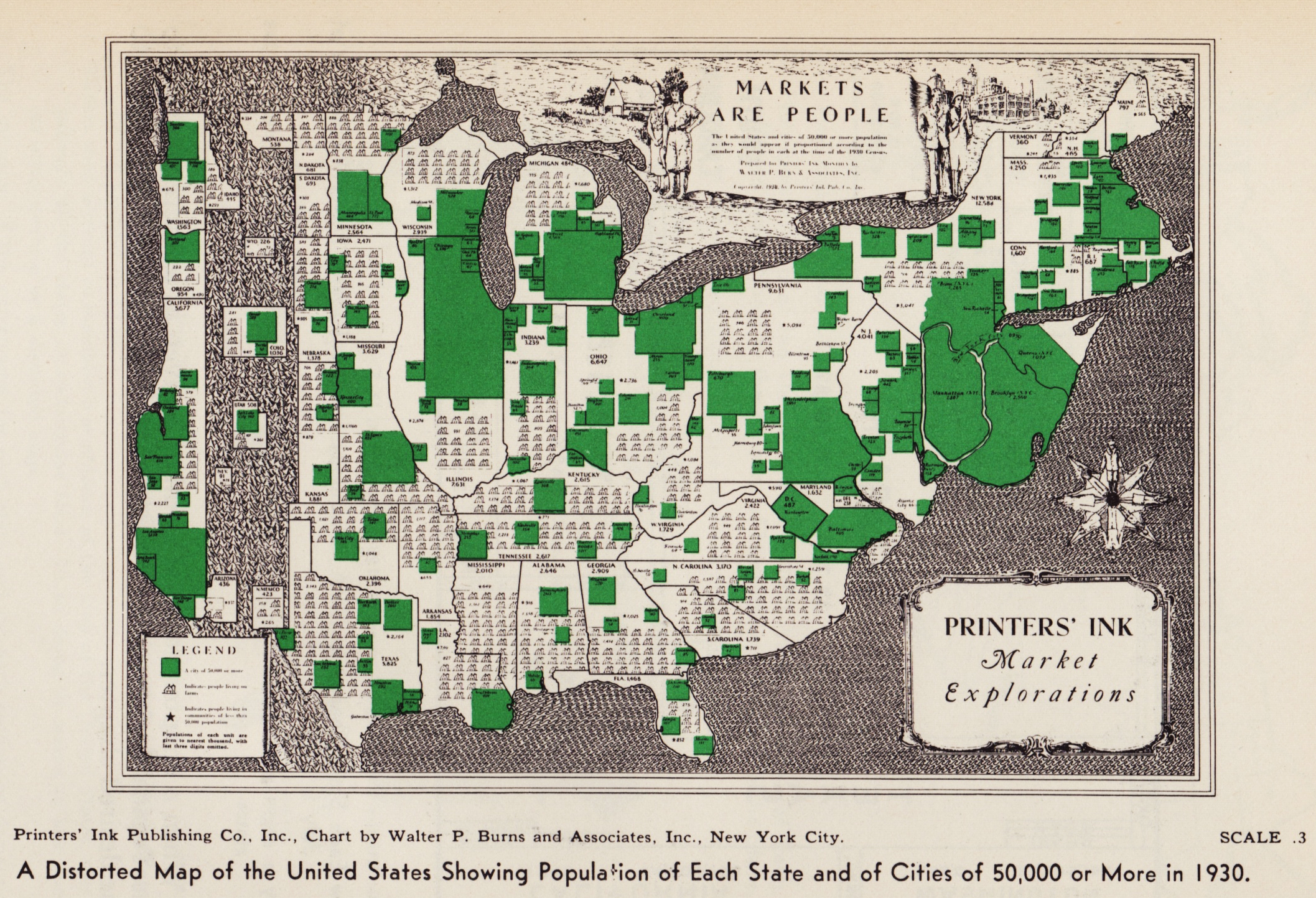
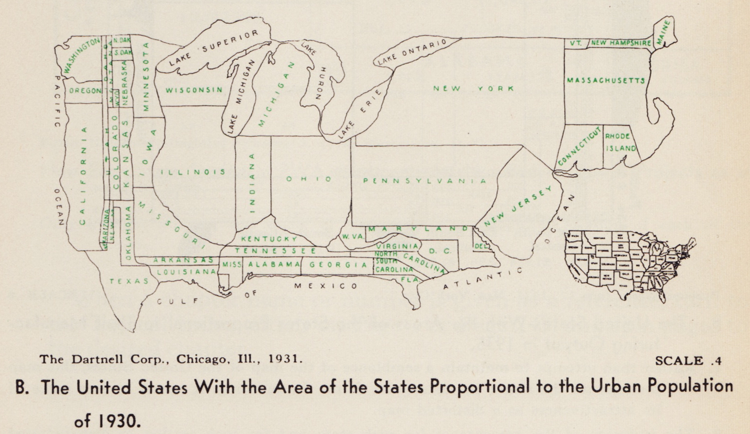
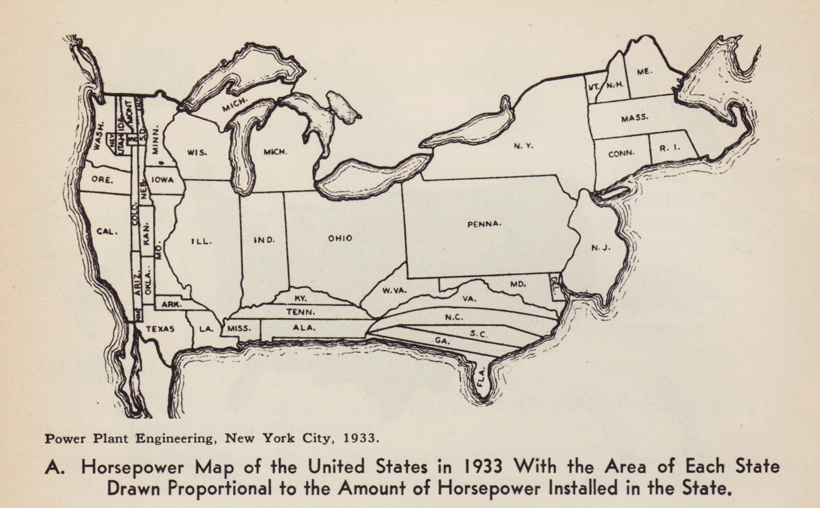
(a) 1921 cartogram of USA based on electrical energy sold for light and power; (b) 1930 cartogram: "A Distorted Map of the United States Showing Population of Each State and of Cities of 50,000 or More in 1930" (c) 1931 cartogram: "The United States With the Area of the States Proportional to the Urban Population of 1930"; (d) 1933 cartogram: "Horsepower Map of the United States in 1933 With the Area of Each State Drawn Proportional to the Amount of Horsepower Installed in the State".
- J. J. Reyes Nunez. The use of cartograms in school cartography. Thematic Cartography for the Society, pages 327 -- 339, 2014.
- Cartogram -- history. http://makingmaps.net/tag/cartograms-history/
- S. Fabrikant. Commentary on "a history of twentieth-century american academic cartography" by robert mc master and susanna mcmaster. Cartography and Geographic Information Science, 30(1):81 -- 84.
- W. Tobler. "Thirty five years of computer cartograms." ANNALS of the Association of American Geographers 94.1 (2004): 58-73.
